


This Typographic Satire was inspired by the type of stylistic appropriation which causes certain design choices to transform from their once refined and historically significant status into worn out cliches. My love for typography and the history of visual communication teamed up with my distaste for superfluous design decisions to result in this satire.
It is a typography lover’s ode to designing with purpose rather than following the trends that tend to undermine our rich and meaningful visual history.

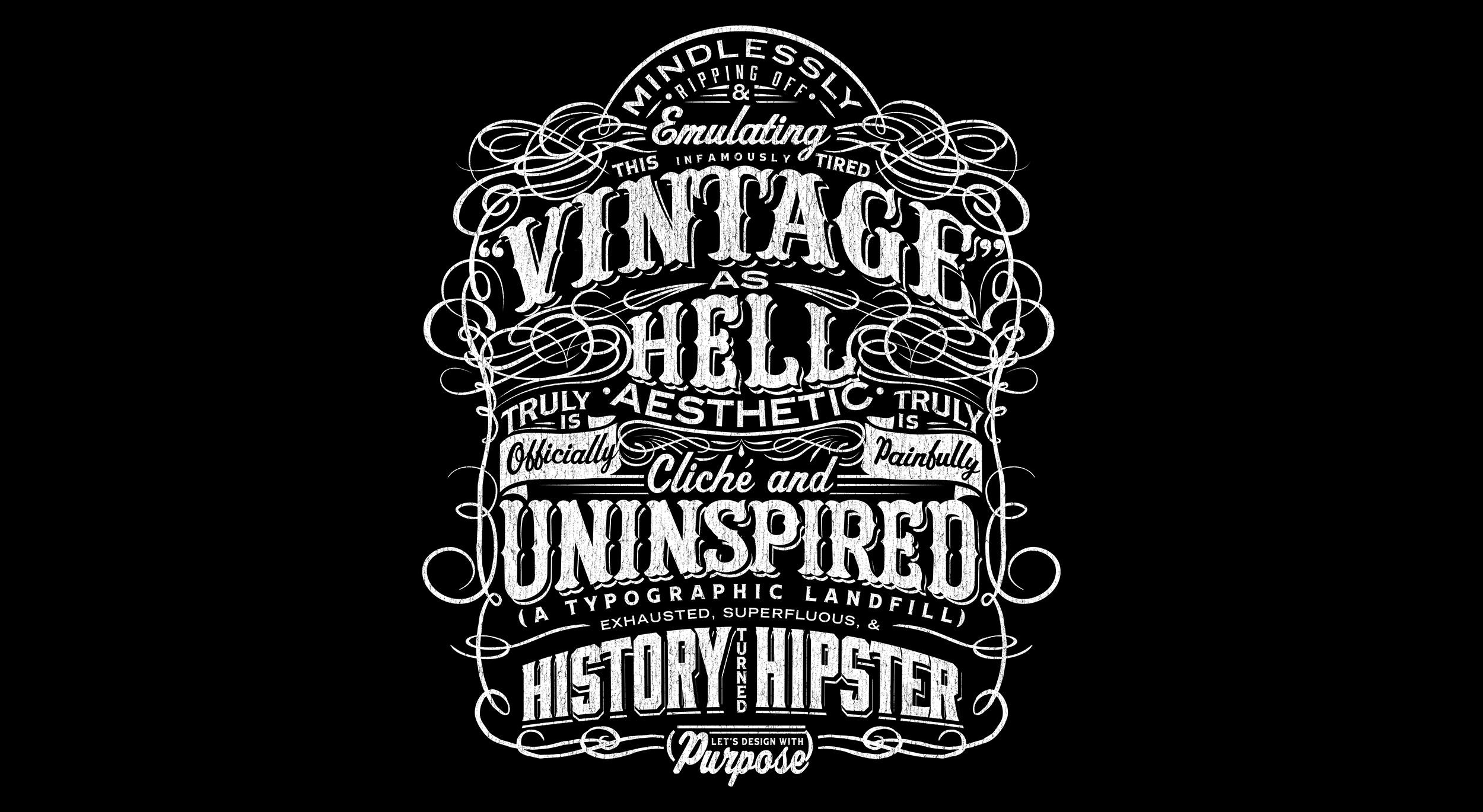

My sincere sentiment in the copy stands in opposition to the way it is rendered visually, using the exact stylistic faux pas that the copy is criticizing in order to create the reward for the viewer. People like to figure things out, unlock the seemingly hidden, and when the result feels pleasant they will remember it.
To support the concept, I leaned into using the very application that is increasingly responsible for the watering down of this once formal ‘style’: the t-shirt. Anti-formal. Whereas such specific style of layout, type choice, and ornamentation was experienced as ‘fine’ and ‘established’ by those who interacted with it in the wild during its original context in history, the fact that it will now be most commonly found on something as unceremonious as a t-shirt is inherently comedic.
If you can’t beat em, make t-shirts I guess.